Many say that XP is still the best Windows OS available. And I agree in almost entirely. Yes it has good look and good user interface, at least better than 7, where the control panel is kinda messed up at least with normal and advanced display options. I have searched many times for couple settings, but keep getting using few minutes before realizing, I have been searching in wrong place etc.
XP has basic looks, but as I find myself liking for nice graphic interface, 7 is more for me in that case. And XP doesn't have DirectX 11 support as it supports only to version 9. Yeah, maybe I'm going with the rest of the audience too much...
 As soon as I heard Microsoft was making new OS, I was interested. And same time I thought, what are they going to do for new OS that they don't already have in other systems. It would be hard to beat any previous system, because almost all of them work well. Now as time has passed and Windows 8 Developer Preview (the 8 is a codename what I have heard) is in test phase, so what the heck. It has 3 versions of it now: 32 and 64bit versions and 64bit version with developer tools in it. Of course I wanted to try the developer tool version, but it required about 5Gigabytes of space on DVD disc. At the time I had only 4.7Gb disc so I had to try the plain 64bit version. The installation went in the same way as previous two OS's, nothing special in there - which was quite disapointment for I hoped for updated installations windows. After installation copied the files and restarted, screen popped up with new UI (User Interface) with different settings to config the files after the final part of installation. To my opinion, there were too many choices for information gathering.
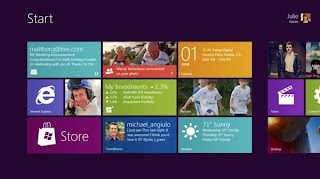
 8's new Metro UI is pretty fun idea, but still it looks little bit too plain. All the programs you install to use them, will be showed in this interface. Luckily you can place all the apps however you like and even delete the shortcuts from the Metro UI or just realign them.
But what comes for settings for apps and other programs on Metro UI, they are quite oddly placed. After starting an app, you have to move your cursor to bottom left to have menu pop up and then select Settings option. How do you remember this or even understand to do this is beyond me. Same problem was with Shutting down or Restarting the computer. First you have to go to Desktop view (You can do it in Metro UI too, but I'm going to specify the "old style"), bottom left to open menu, Settings and then selecting the Power icon to have power menu pop up for restart, shutdown etc...
And if you want to change between Metro UI and classic UI, you have to shut active app in Metro and then press Windows key, and if you're in Desktop, pressing Windows key takes you to Metro.
It may feel complicated now, but don't know for sure. Some apps, if not all, have other settings or maybe "UI settings" showing up when you press right mouse button and yet other settings are completely elsewhere located. For some this may work perfectly, but I don't see any ideas behind this innovation.
In short:
Windows 8 is kind of nice update for new system, but I don't know if two UI options are the way for specially new users. It may take while to catch on with it...we'll see.

No comments:
Post a Comment